Tokyo’s station-level research backbone
The datasets below power all Tokyo-Insights tools and investor briefs: transaction-based pricing, rent modelling, GRM distributions, yield ranges and accessibility layers. Every chart comes from the same proprietary research pipeline used for investor screening.
Core pricing dataset — transaction-based
Station-level pricing provides the baseline for all GRM and yield modelling. Unlike portal asking prices, this dataset is built from recorded transactions and segmented by layout, building age and walk-time bands.
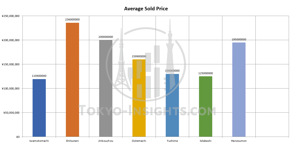
- Uses closed transactions, not listing prices
- Segmented by layout (1K / 1LDK / 2LDK+)
- Adjusted by building age & walk-time bands
- Forms the baseline for yield & GRM interpretation
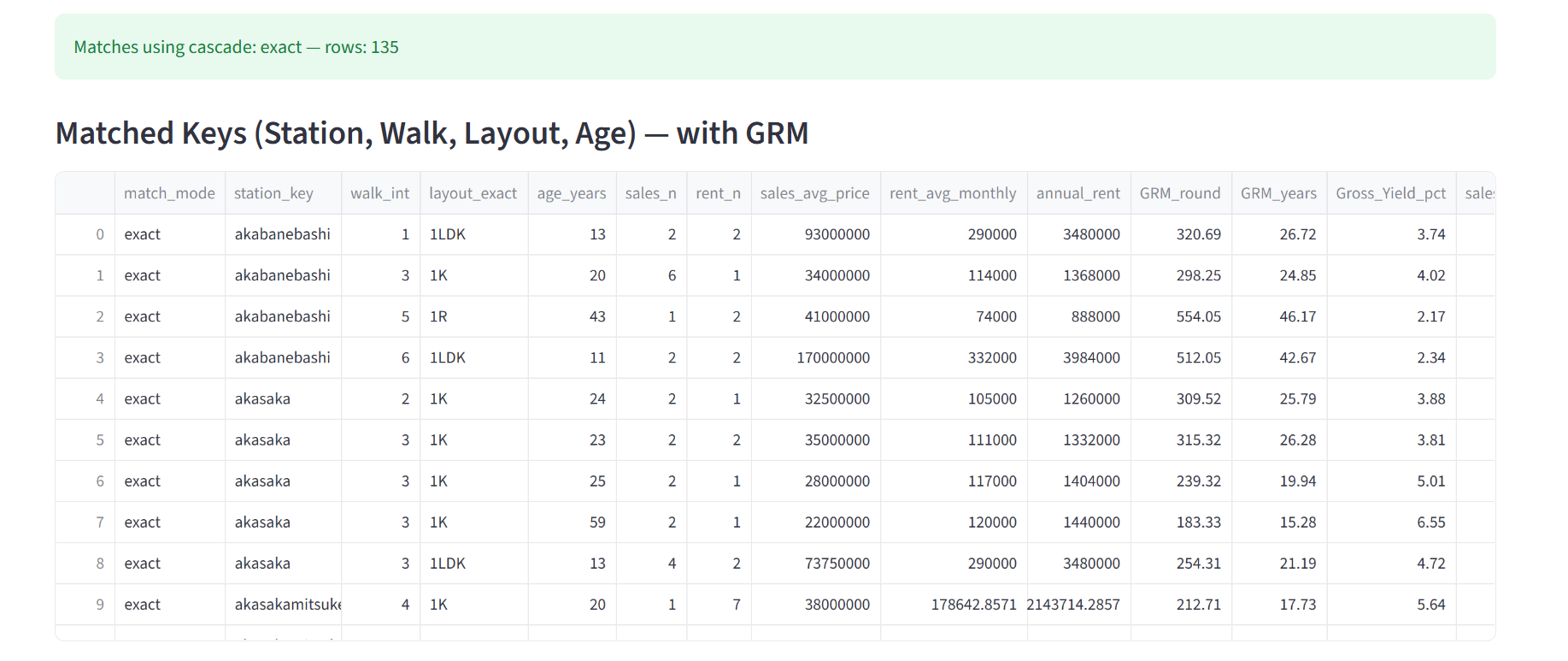
GRM & yield modelling — matched sales & rent pairs
GRM and yield ranges are computed from matched historical sales–rent pairs for each station & layout. This makes it possible to assess whether a given listing is aligned with, above or below recent market behaviour.
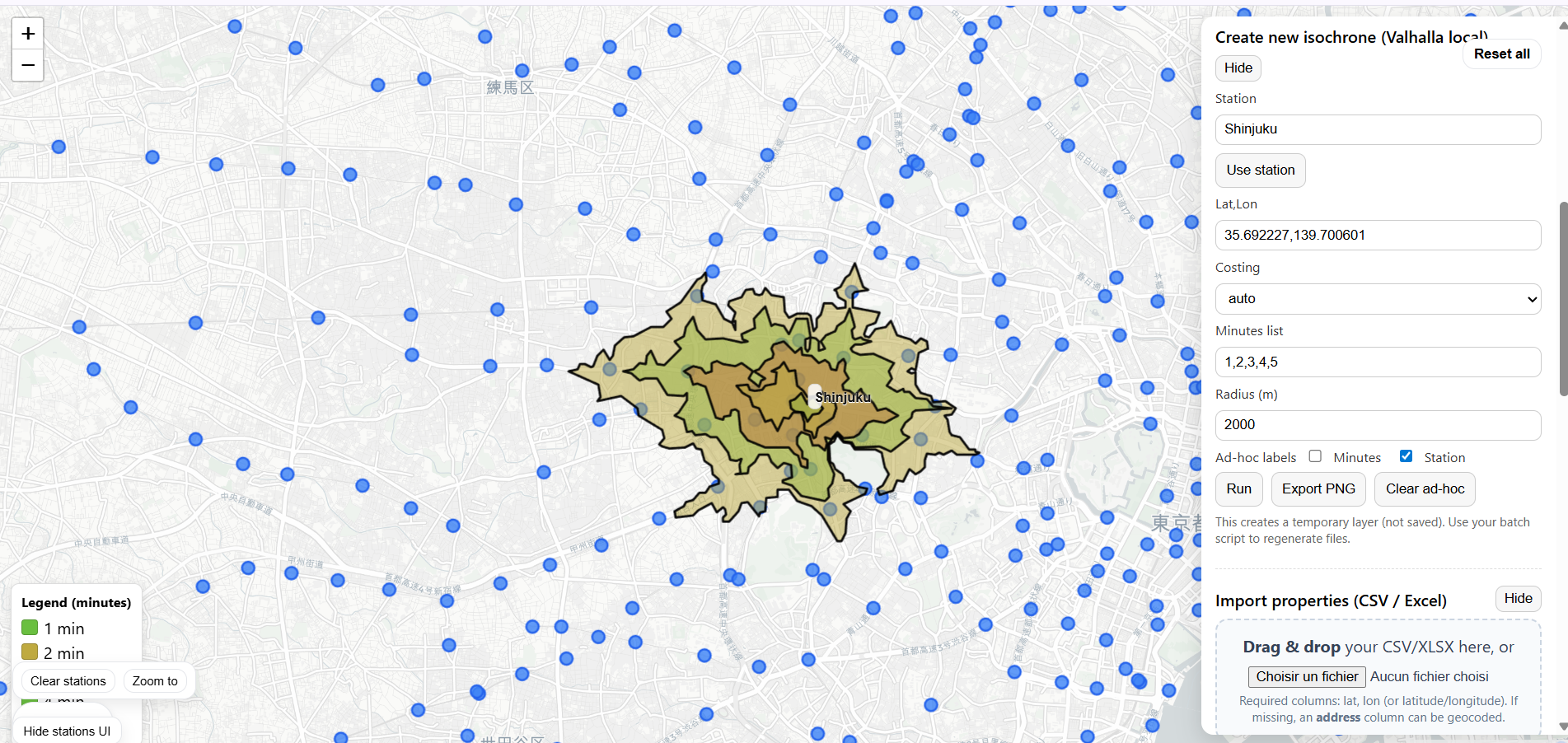
Spatial & accessibility layer — isochrone modelling
Walk-time sensitivity is one of the strongest drivers of rent levels. Isochrone maps allow investors to visualise the real catchment area of each station and compare how accessibility differs across submarkets.
How investors use this research
- Benchmark listings against station-level GRM & yield ranges before screening
- Compare alternative stations (e.g. Meguro vs Nakameguro vs Ebisu) using data, not heuristics
- Identify mispriced layouts using age-adjusted GRM distributions
- Assess rent resilience through walk-time segmentation and isochrone catchment
- Document acquisition logic for lenders, partners or internal committees